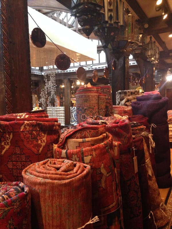
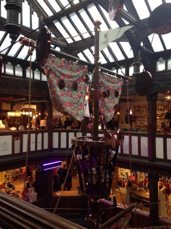
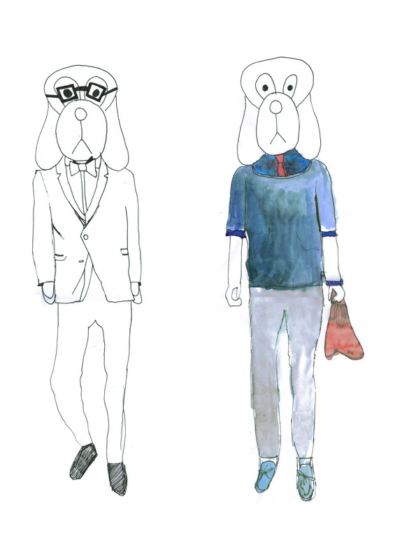
I love these two photos and I took in Topman flagship store, Oxford Street.
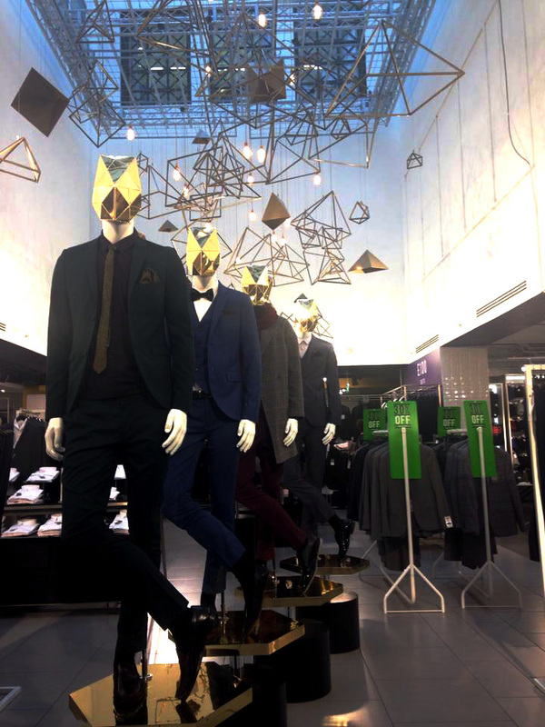 |  |
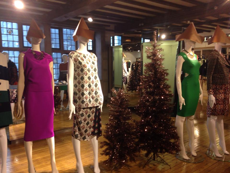
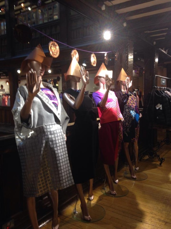
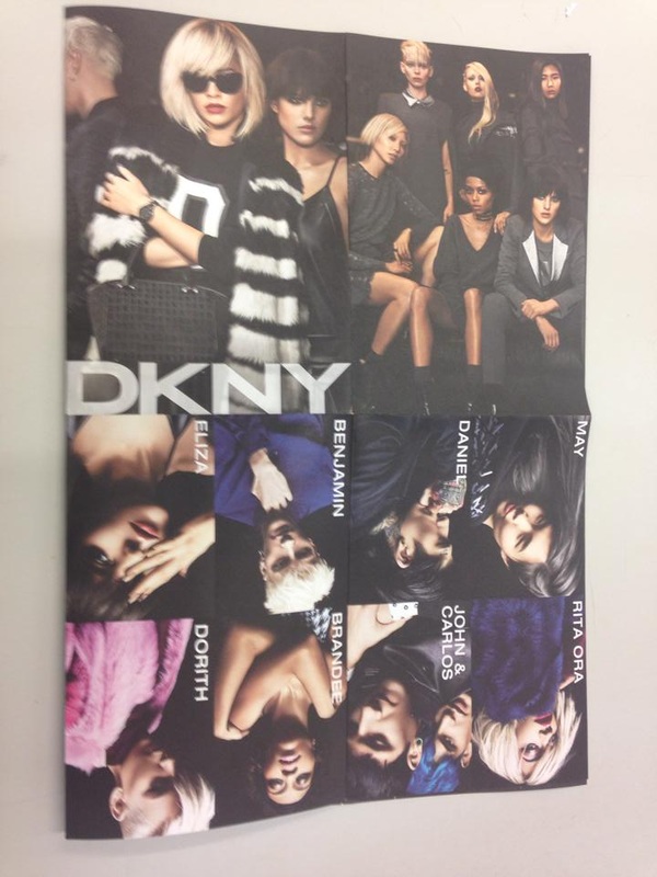
Walking onto the magical ground floor of Topman, the first thing I noticed was the central display. My eyes followed down an array of hovering prisms onto 4 mannequins positioned in line. Like robots, each mannequin held the same stance armoured with a stern gold mask. Dressed in smart, the mannequins wore skinny suits in popular festive shades of navy, bottle green and burgundy. These colours, mixed with gold used in the masks, prisms and podiums, warmed up and tied together a very cold angular display. This futuristic display was a clever, contempory take on a Christmas display that worked well in the trend setting store. Bionic, trendy men off to a formal Christmas party; Something I have never seen before.
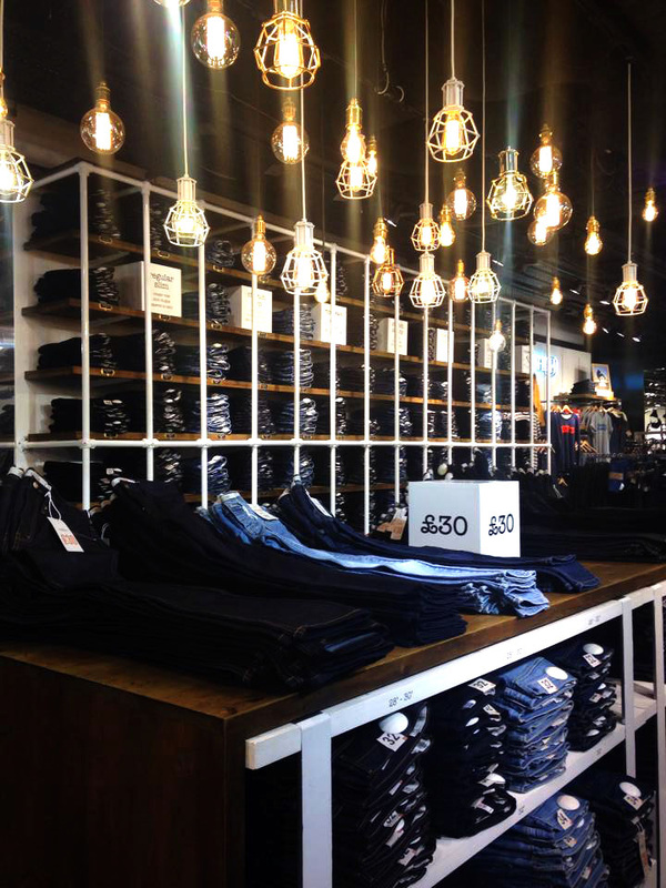
The photo of the denim department gives off a rustic ambiance. It was emphasized by visual merchandising of the high stacked jeans and dangling, factory lights. It was like the stores own mini denim warehouse. This photo would not be as effective if the jeans weren’t folded with such precise and order. Being a denim specialist at Topman Sunderland (where the floor size is not even an eighth of the Oxford Street Topman) I was blown away when I saw how many pairs of folded jeans there was. I know from experience how long it takes to get a pile of jeans to such a high standard! The denim department was exceptional as if a team of elves had been in overnight.
The photo of the denim department gives off a rustic ambiance. It was emphasized by visual merchandising of the high stacked jeans and dangling, factory lights. It was like the stores own mini denim warehouse. This photo would not be as effective if the jeans weren’t folded with such precise and order. Being a denim specialist at Topman Sunderland (where the floor size is not even an eighth of the Oxford Street Topman) I was blown away when I saw how many pairs of folded jeans there was. I know from experience how long it takes to get a pile of jeans to such a high standard! The denim department was exceptional as if a team of elves had been in overnight.


 RSS Feed
