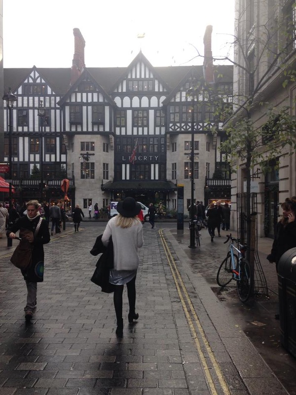
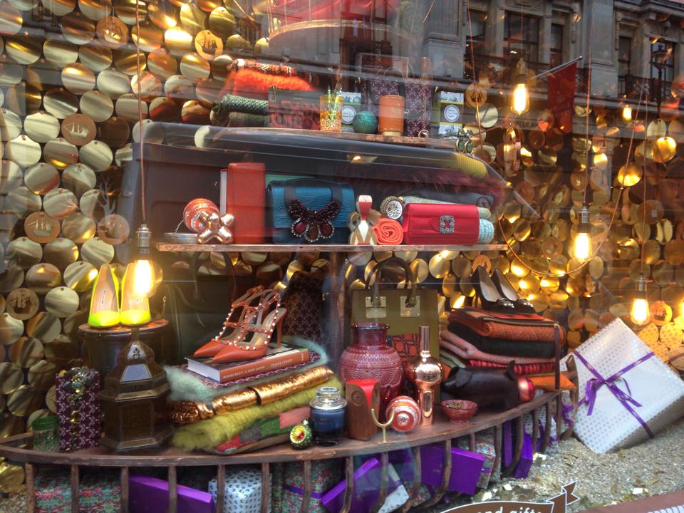
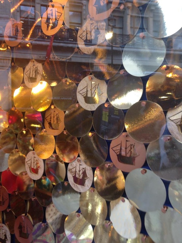
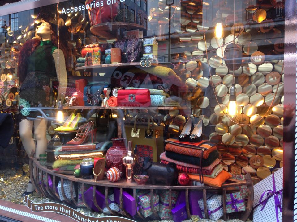
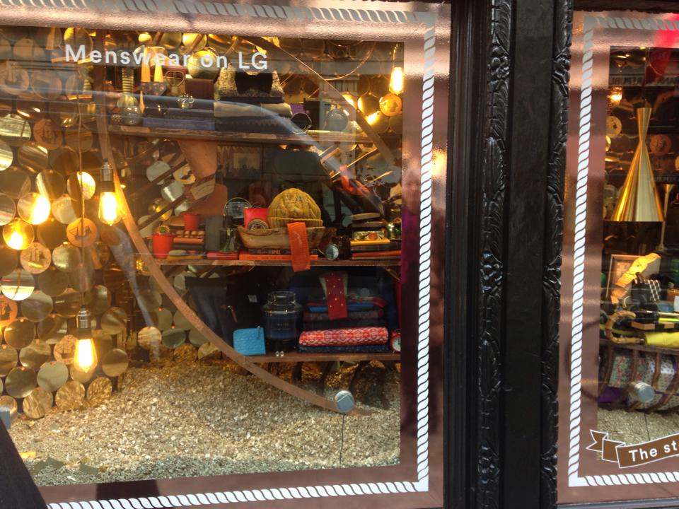
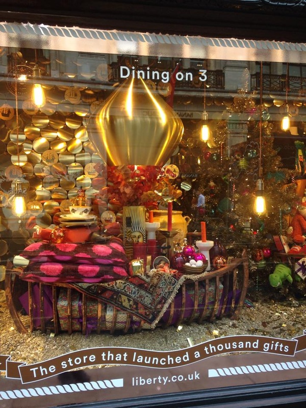
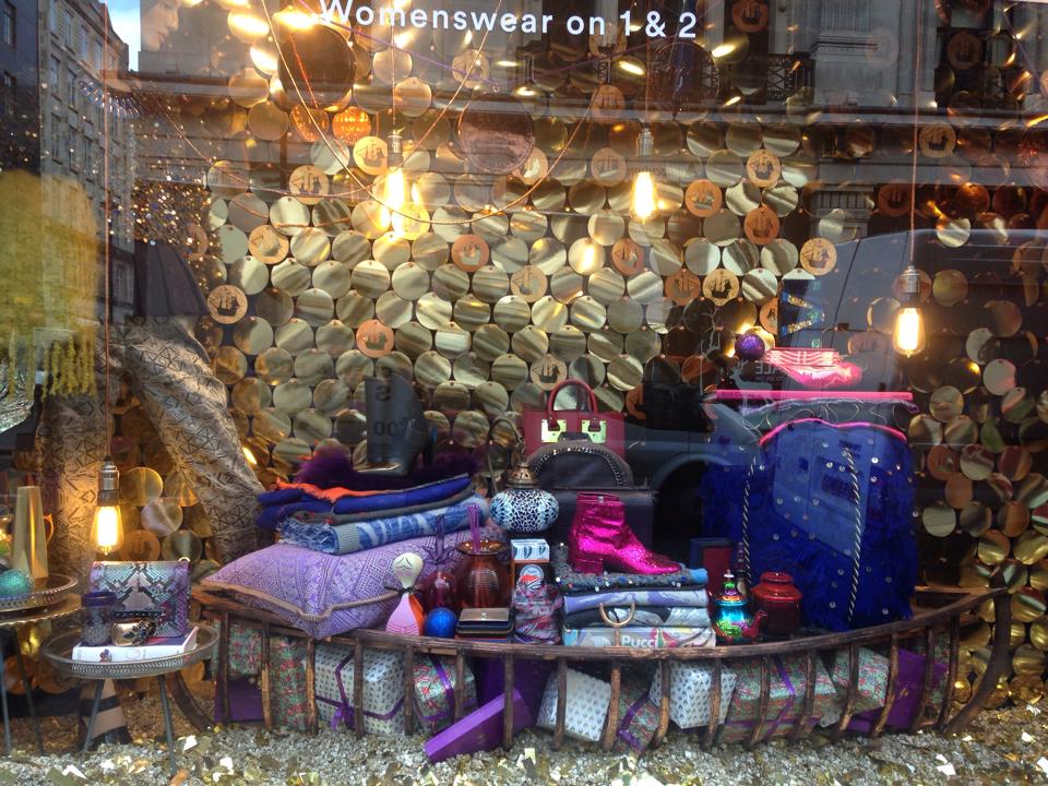
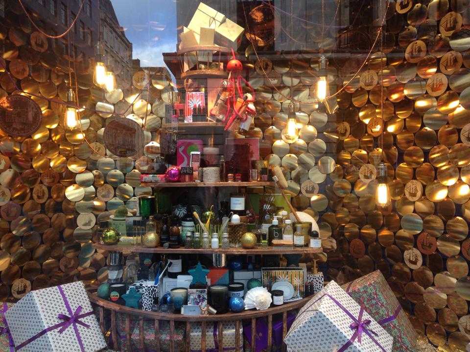
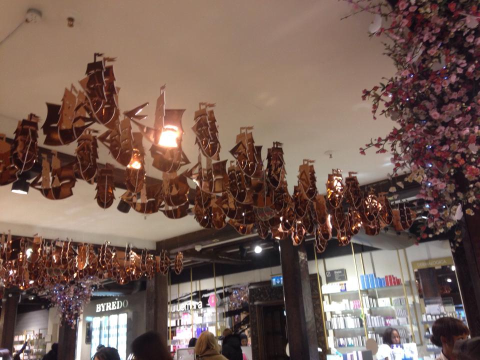
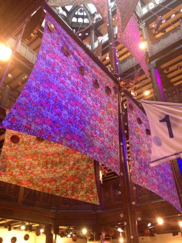
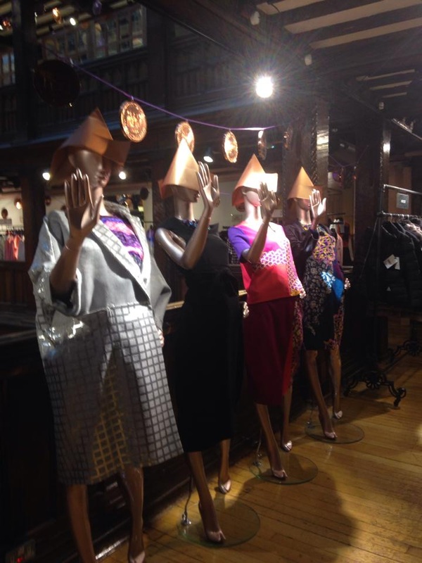
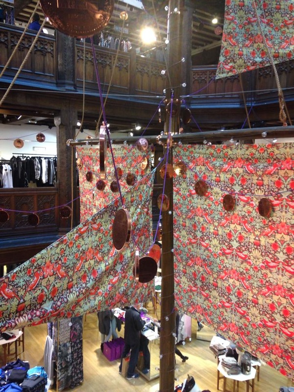
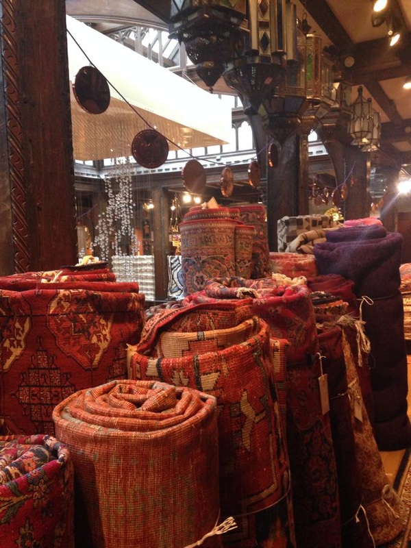
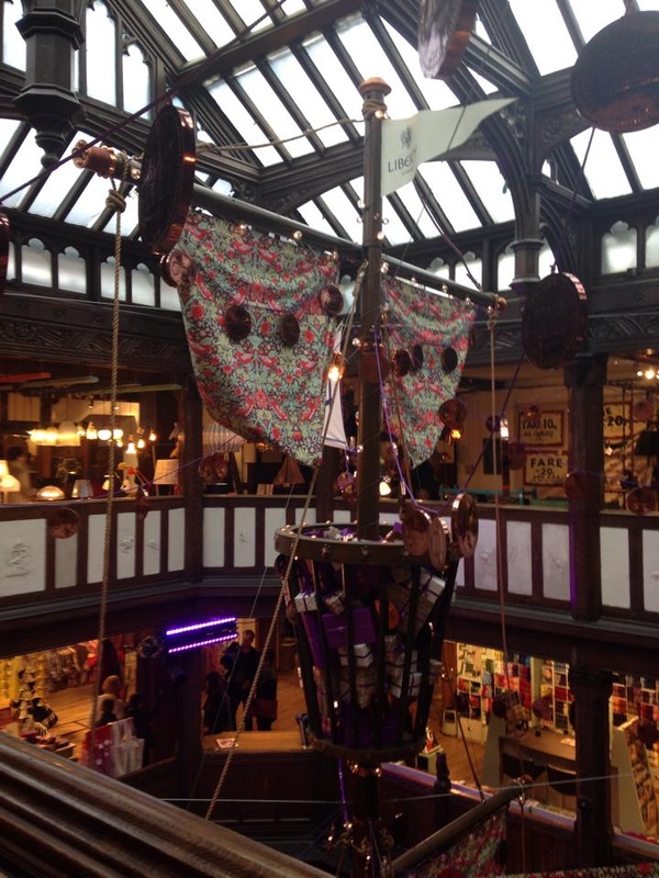
| After watching channel 4’s behind the scenes documentary about Liberty of London I was excited to see the final Christmas window and store concept in real life. Managing director of the store Ed Burstell claims that ‘Christmas is one of those things that liberty owns’. It was head of the visual merchandising team Liz Sylvester who was in charge of living up to the Liberty standards by designing her first Christmas window for 2014. The concept of the Christmas window came from the heritage of the building. Originally the building was constructed of the timbers of two retired war ships. This is where Liz Sylvester got her initial nautical idea to run with. As a customer, weather you know the history behind the store or not, you still feel like you are on board the Liberty ship travelling around the globe. Gold disks lined the walls of each window, some printed with boat silhouettes as if they were coins. The silhouette represented the iconic liberty weathervane. Each window felt like the inside a treasure chest filled with Liberty beauty, fashion, accessories and homeware products. The products were all rich in colour from purple and turquoise. In contrast they were stacked high in old wooden boat frames. The main focal point of the store was the large ship mast that stood in the centre of the shop, in the famous scarf hall. It drew your eyes from the ground floor all the way up to the 4th. Hung from the mast were ship sails made from liberty fabric called strawberry thief. From the sails were suspended oversized coins swinging across the store from purple rope. As you travel from floor to floor you can see the ship mast from a different angle, each one as breath taking as the last. The theme carried on through the store in every little detail leaving no stone unturned. Even the mannequins wore bronze paper sailor hats. After seeing the work done at Liberty and the Christmas window concepts from the second years (reviewed 6/12/14) , both displays demonstrate strong concepts based around a central focal point. This is a device which is used to tie the display together in a narrative which makes it appropriate and enjoyable for their target market. | 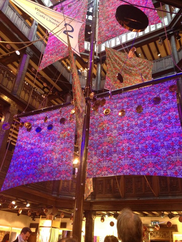 |
|
0 Comments
As a symbol of my fun younger market I decided my model had to be Bibi, my sidekick living it up in Shoreditch. True to form, that morning she missed her train and after a dramatic sequence of events she made it to Newcastle in the nick of time. So despite my meticulous planning for the day it just goes to show that you should always expect the unexpected. I rushed my model to Mac in Fenwick then dashed back to college to meet my photographer @_BUMBLEYBEEE to get the photo shoot underway. Owing to the chaotic start to the day, it took a little while for Bibi to warm to the camera and reveal her playful self. My role was to keep my model calm and demonstrate exactly the professional poses I wanted to achieve from the days’ work. I found it challenging explaining my concept to both Bibi and the photographer. I think this could have been eased if I had had my own privacy, however, this was just another constraint I had to work with. Below are my final chosen photos for my Topshop Petite look book. For me the most important element of my photos were the poses. I wanted her to represent the younger market through the use of fun movements and shapes. From my research, I gathered images of poses I thought were alternative and cool. I am proud of Bibi who worked really hard in difficult conditions to set the right mood. Looking back at the final edits, all the other factors complemented each other – from the styling to the makeup and hair. When I look at the project as a whole, the photos flow and reflect the concept really well. I now have a final look book I can be proud of.
After checking out the second year work, to my surprise I came across my own mini display. It looked fantastic! All of the layouts and colours flowed and the images around the outside tied the display together. I loved seeing my work presented like this, it looked even better than expected!
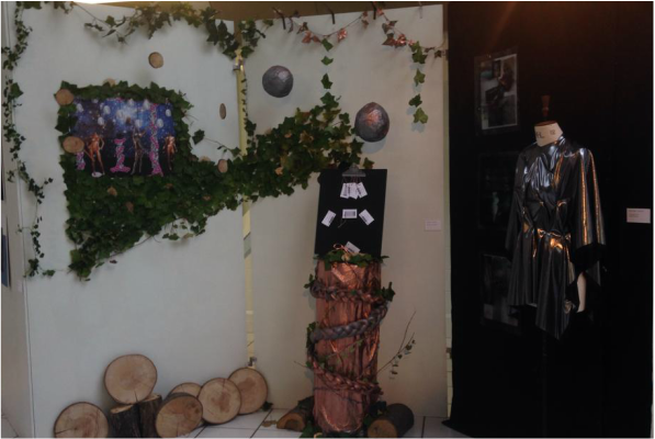 Today I went down to have a look at the final presentation of the second year’s project. They had been set a live brief to create a Christmas window concept for Topshop. I was interested to see how they would interpret the Topshop Christmas window after seeing unusual creations forming around the classroom over the previous weeks. One particular concept which caught my eye reminded me of a futuristic jack and the beanstalk. They had taken a traditional Christmas theme of fairy-tale and added a modern twist by sending it into year 4015.
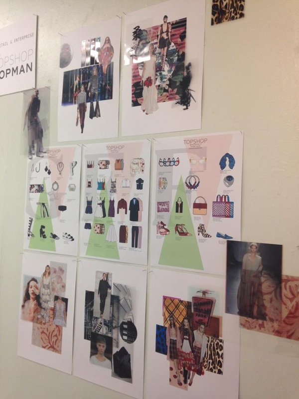
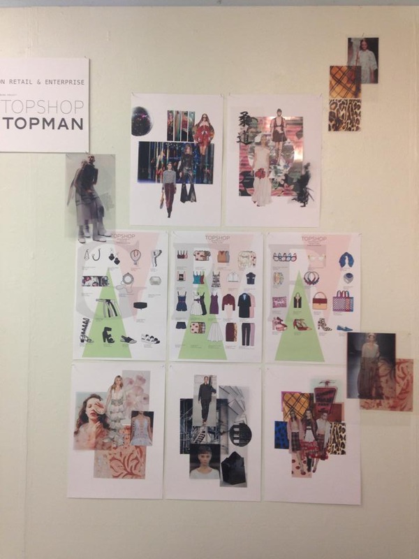
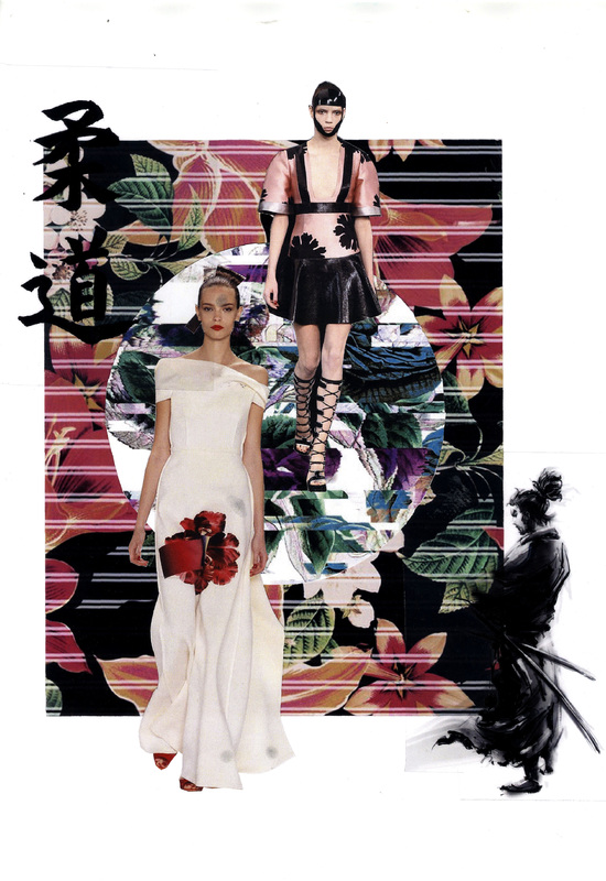
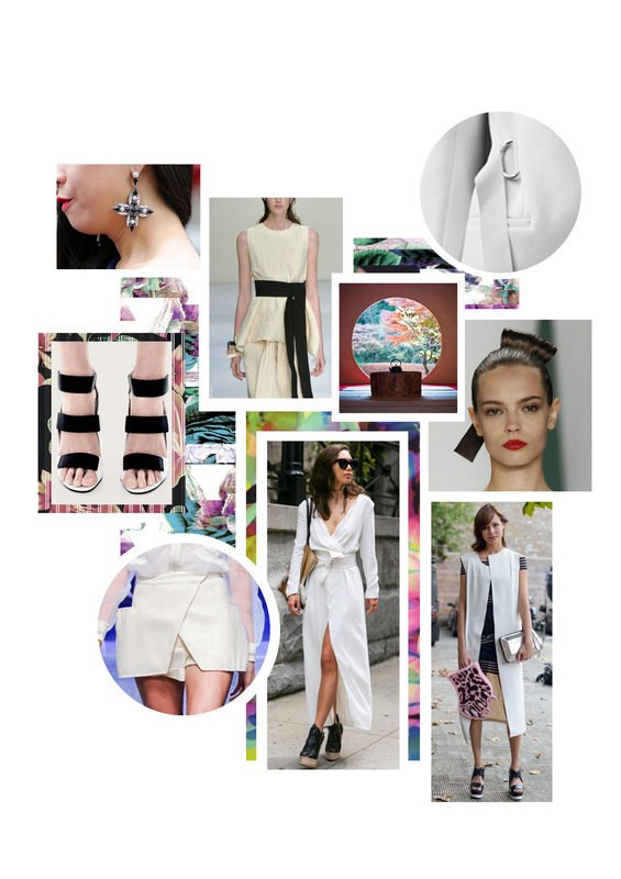
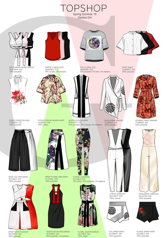
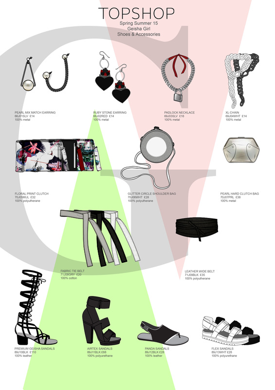
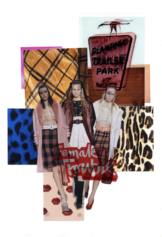
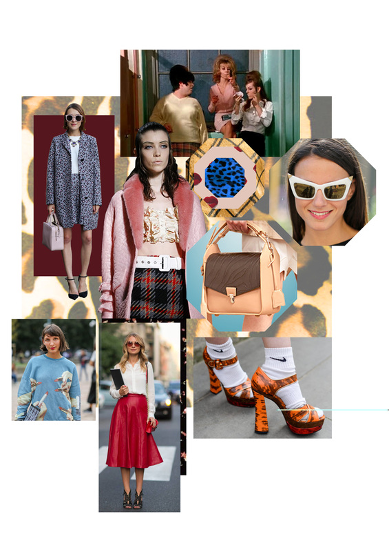
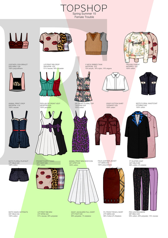
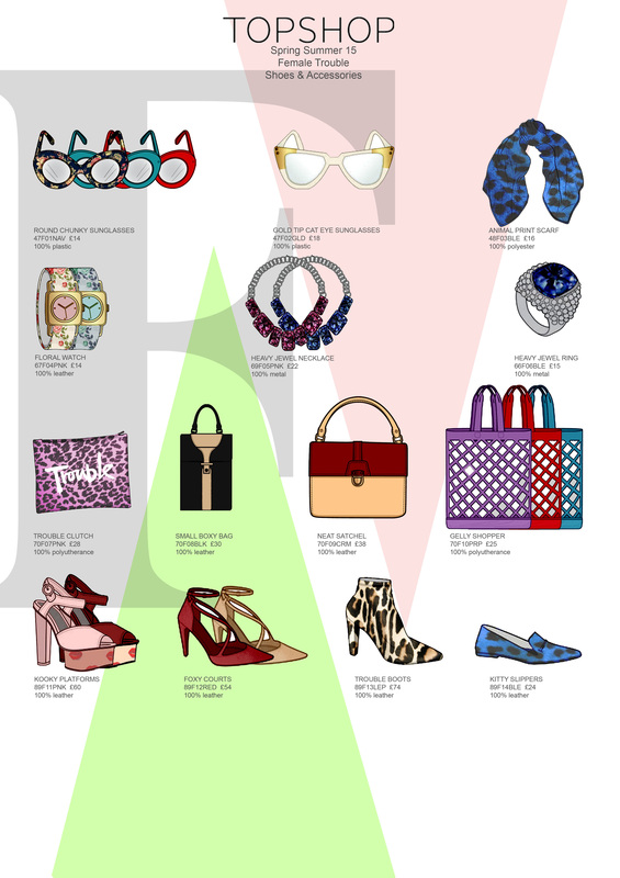
A large metallic beanstalk was used as a centre piece for the concept which really brought the theme to life. I could imagine the beanstalk growing through the Topshop window display and twisting around the mannequins. The work flowed with a strong concept as over grown ivy was used to tie it all together. Looking this work I have realised you have to take the brand into consideration. In this particular piece of work I can see how they had looked at the current Topshop trends to help design their concept. With the metallic colour scheme used in the window concept and lots of glitter, black and metallics used in the party wear in store (which is extremely popular around this season), I could imagine the window to compliment the garments worn on the mannequins. Although I like the concept, there is potential for further development. On the other hand, I feel that for a high-street retailer like Topshop, an abstract approach to the idea would be more appropriate in order to enhance the brand, whereas a literal approach would be better suited to a department store, whose range is far wider. Therefore, if I was given this brief for Topshop I would look at using a selective approach to a theme to make it more relevant to the brand. For my first project of the course I was given a live brief with high-street brand Topshop. The brief was to pick five catwalk trends and develop my favourite two into suitable ranges for Topshop. For my first trend I went down the oriental/Japanese route after being inspired by Alexander McQueen’s spring/summer15 collection. The trend includes clean lines, monochrome and digital florals. I also loved Miu Miu’s spring/summer15 collection inspired by John Waters film Female Trouble. This directed me to an American 60’s trend that would be loud, fun but tailored. With background knowledge of previous Topshop trends, I thought these trends would fit the brand and be popular with Topshops trend setting target customer. From creating a mood boards, I then went on to create a trend board. Through feedback I found that my initial trend boards did not display enough customer and garment images. In my second attempt I considered how Topshops target customer would portray this trend by looking on blogs, magazines and social media. These boards helped me produce my favourite part of the project, range plans. I got to be creative and make my idea seem like a reality. I created garments on Photoshop using CAD flats that would come together to make a trend and outfits. I started the course late which meant I was behind in this task. I had to put in extra hours of work to make sure I did not miss the deadline. I feel my high level of computer skills benefitted me in this project to catch up to the dead line. I learnt in this project that receiving feedback is an effective way to improve my work. I handed in my project with boards that successfully presented my concept. I enjoyed the task and would be interested in looking at a career in a buying role. These are my final boards that show how my catwalk trend has developed into a Topshop range.
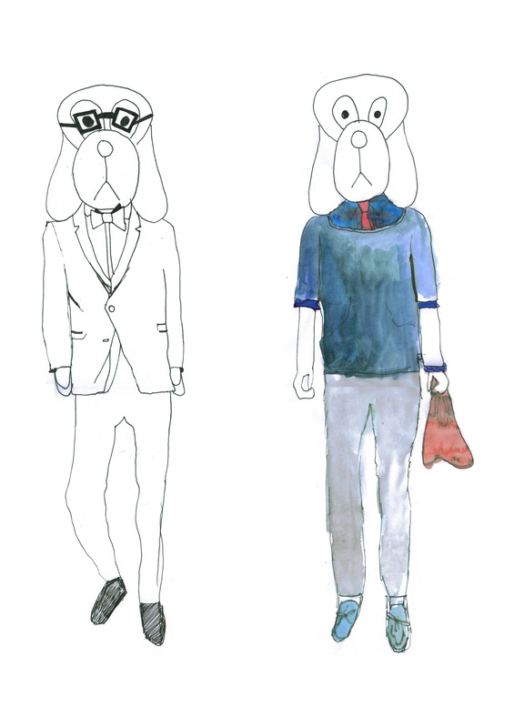
 Upon my search for fashion illustrators I have come across another character Sew Sketchy. I discovered her on Instagram and after falling in love with her sassy style I went on find her blog. I seem to be drawn to illustrations that centre their work on the fashion rather than the figure and face (like Fifi Lapin). I also love that these simple characters have an interesting personality behind them. Sew Sketchy is described as a chain smoker and New York fashionista. In an interview with her illustrator, Romy Schreiber, she describes Sew as being ‘over the top, borderline inappropriate and on the cusp of maybe sometimes offending people with her obnoxious attitude’. You can really understand this by looking at her in the illustrations with her signature oversized glasses, burning cigarette and dramatic pose, not to mention the clothes she wears. Romy Schriber has been in the fashion industry since she was 15 and was born and raised in New York herself. She created this character when she was in Parsons School of Design. I like how she has used a thin simple line to draw the figure. She has a signature long neck, realistic pout and big glasses. There is a lot of black and white detail but only one or two tones of colours have been used on the garments. After studying both Fifi and Sew, It seems to me that the key to successful fashion illustration is balancing these two opposing elements - strong individual personality with universality. In both illustrations, the characters are exaggerated in order to allow the viewer to identify more with the overall personality of the clothes rather than just the appearance of just one physical model. http://www.sewsketchy.com/ http://instagram.com/sew_sketchy Inspired by Fifi Lapin fashion illustrations I found myself creating my own character. At first I played around sketching simple head ideas that I found easy to draw. I got into the feel of the Fifi Lapin style by copying the detailed fashion on some of her work. I finally came up with my own character. I have named him Digby the Dog, a menswear fashion icon. I had chosen to use a dog for the face as I learnt this simple drawing at a young age. I find that it is easier to draw the dog as the head rather than a human head as it is an unrealistic sketch and it is impossible to get wrong. Like the Fifi illustrations I focused mainly on the details of the catwalk garments. I experimented using water colours to add colour to the clothes. I am fond of this style of illustration as it allows me to miss out the parts of drawing that I find difficult (head, hands, feet) and focus on the fashion that I enjoy drawing. I think if I kept on practicing with this character and perfecting the style I could come up with a really strong fashion illustration.
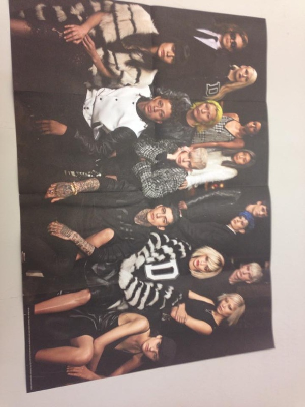
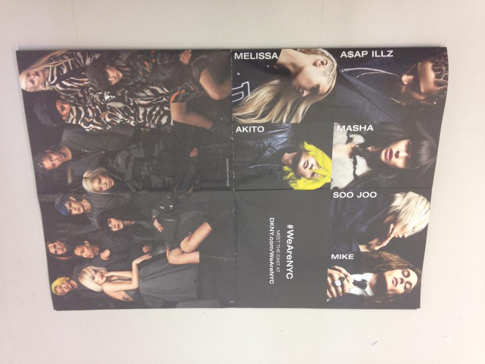
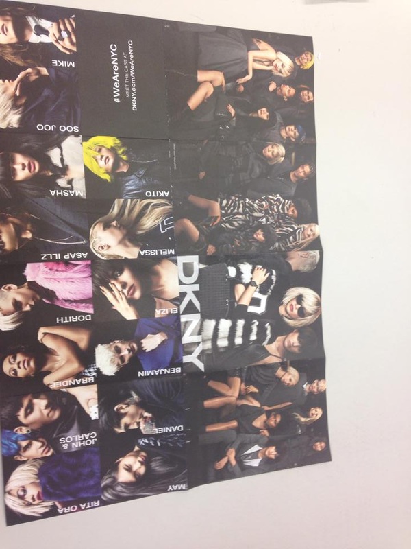
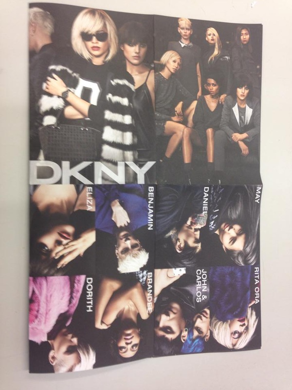
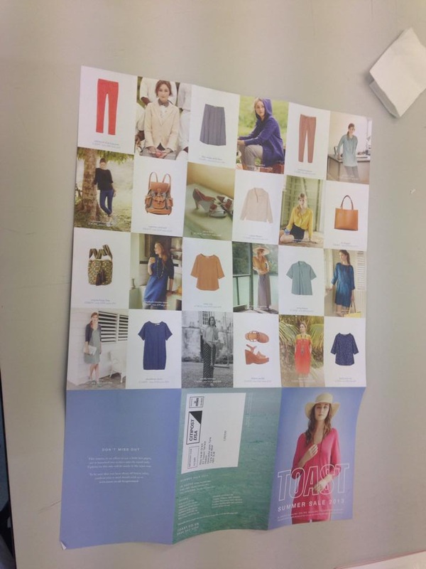
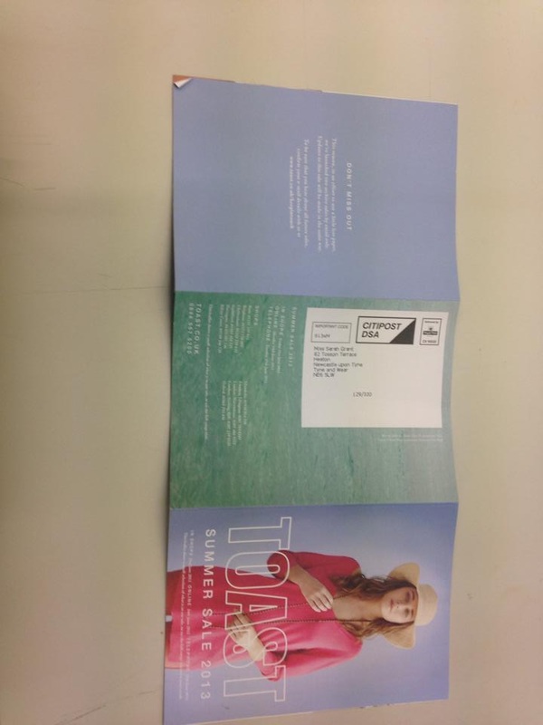
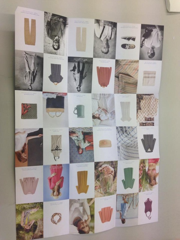
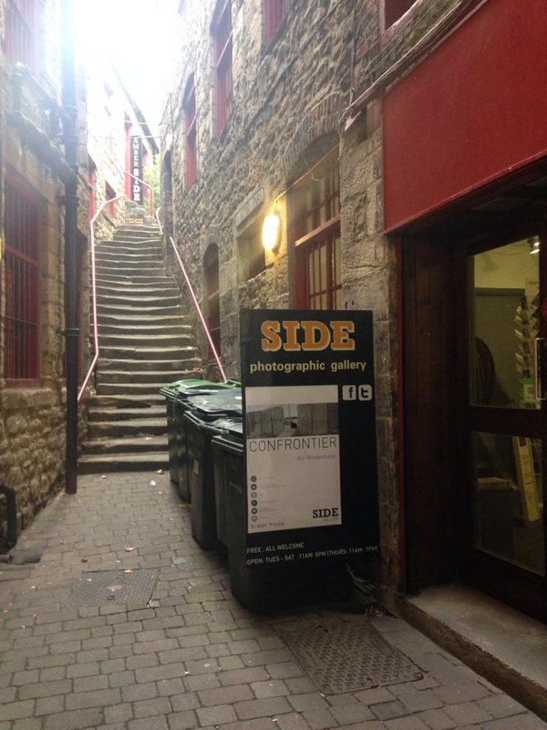
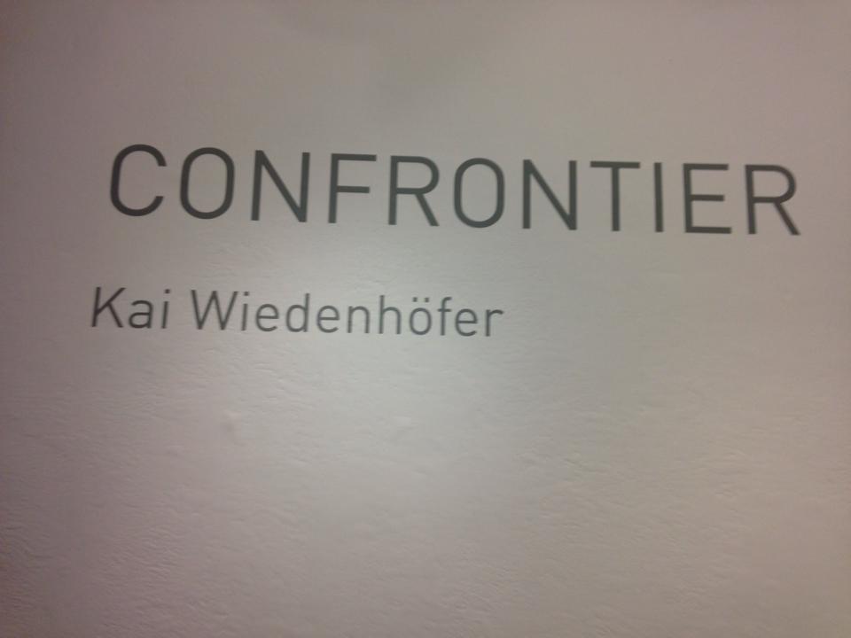
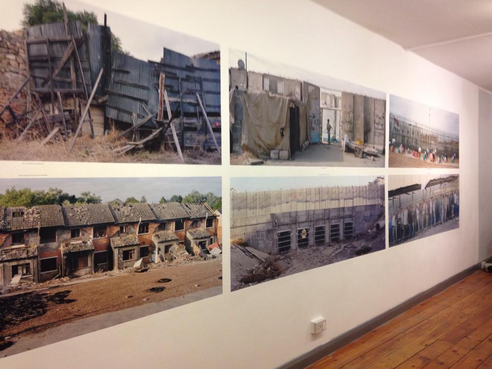
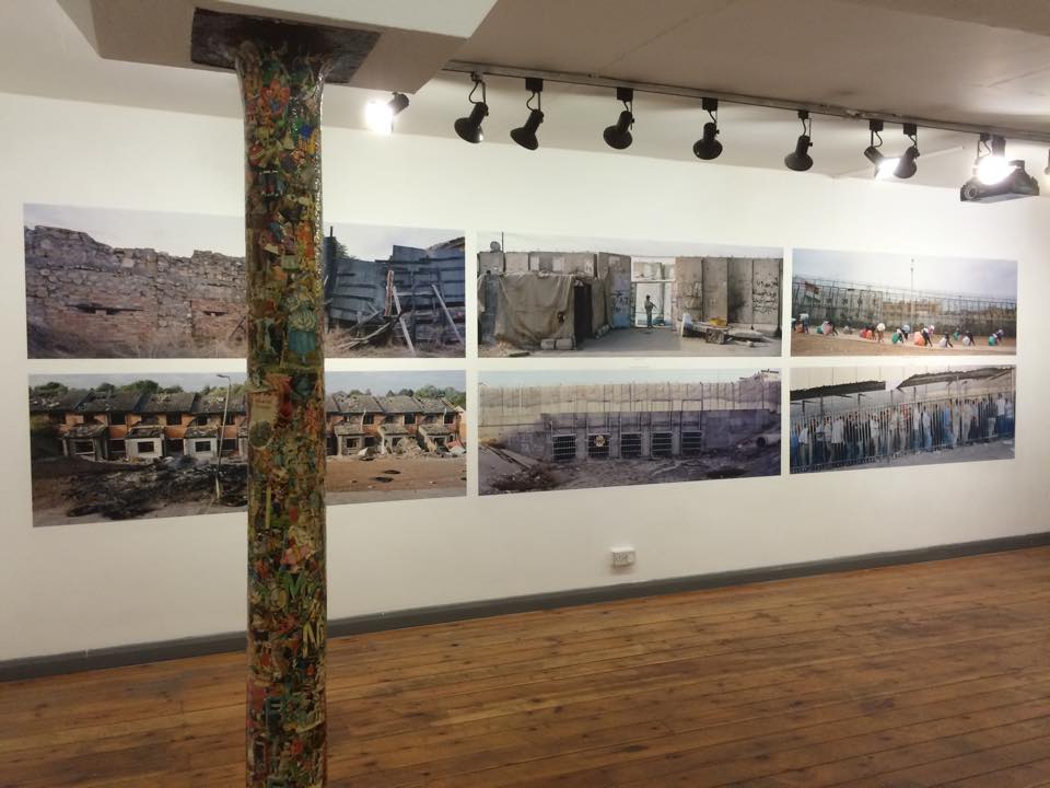
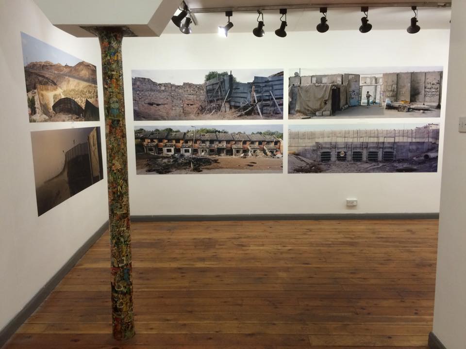
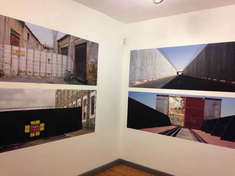
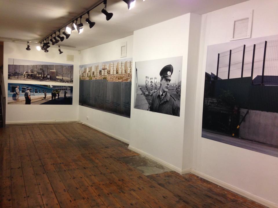
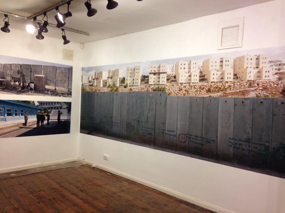
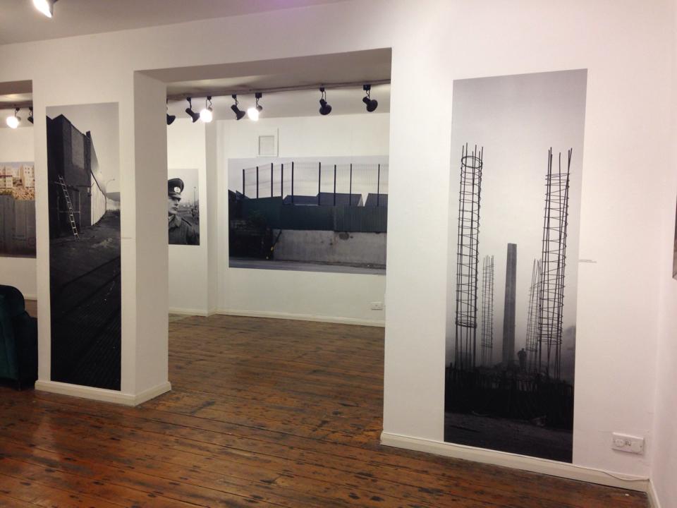
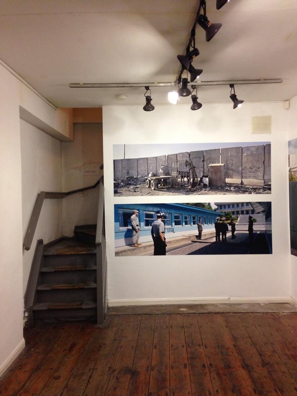
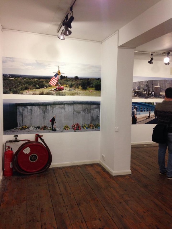
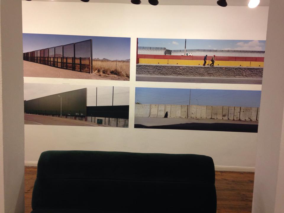
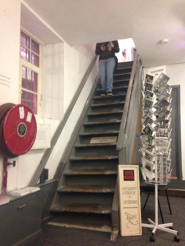
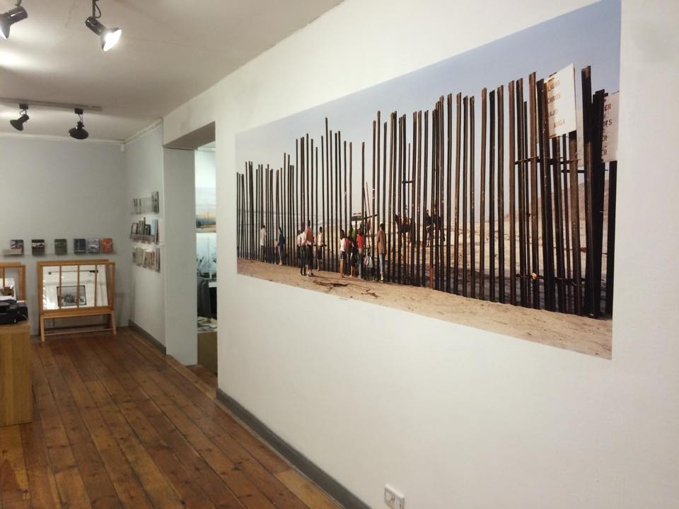
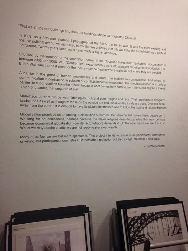
For my current live Branding and Corporate image project with Topshop, I have to create a look book or campaign to promote the sub range I have rebranded using photos from a photoshoot styled and directed by myself. . My look book needed to be fun to fit my rebranded theme of energy and youth that was reflected in the vibe in the photos. Today, to gather some much needed inspiration, I attended a lesson on look book design. My strengths lie in creativity and using computers so I thought this portfolio piece was an opportunity to push myself and create something special (seen as though my photos had turned out so fantastic). After looking through a whole selection of examples, It took me all morning to find two look books that inspired me and got my create juices flowing. I knew in the back of my mind what I wanted but did not know until I seen it. The main feature that I liked about these look books is how they were folded as not your everyday book. Each un-fold was exciting; the exact emotion I wanted to portray in my design. There was an A2 poster on the back a DKNY look book which was another feature I thought the Topshop customer would find appealing. I thought the grid layout on a ‘TOAST‘ look book was a great way to show off the products in a stimulating way. I found this lesson helpful as I took photos and made notes of design features that I could include in my own work. My next step is to create a plan to combine my inspiration with my own look book. A feature I want to use in my final piece is a folding out poster. I will next research and plan a layout to get this complicated folding feature right.  Over the past 2 weeks I have been learning about fashion illustration. I have been experimenting with my creative side and trying out different drawing methods such as blind drawing, continuous line drawing, upside down drawing and non-dominant hand drawing. I have realised that you don’t have to be an expert with a pencil and paper to come up with an exciting piece of art. In my spare time I have been researching into other fashion illustrators and have come across drawings of Fifi Lapin. Fifi Lapin is a fashionable illustrated bunny who blogs herself wearing the latest designer pieces. There are hundreds of cute illustrations of Fifi Lapin that other designer’s, bloggers and fans have fallen in love with. This stylish character has also attracted the attention of the likes of Vogue, Marie Claire and Elle magazine, yet the creator of Fifi is still unknown. Vogue describes Fifi as “an unlikely – yet powerful – fashion force”. These illustrations remind me of an old favourite character Miffy, who was a small female rabbit in children’s picture books. Miffy was written and drawn by Dutch artist Dick Bruna. Fifi Lapin is like a grownup spoilt version of Miffy. I love the style of this drawing as it is so simple yet so unique and recognisable. I personally struggle to get facial features right when it comes to drawing and replacing it with something easier to draw seems like a solution to my problem. Not only could I use and animal character to replace a human, I also feel inspired to experiment trying other things like an object or shape. I have only just found these illustrations and have instantly become a huge fan of ‘The world’s most stylish bunny’ (Elle). http://fifi-lapin.blogspot.co.uk/  Melilla, Spain - Morocco Melilla, Spain - Morocco Side Gallery 9 Side | Quayside, Newcastle upon Tyne NE1 3JE ‘Confrontier’ by Kai Wiedenhofer Today I went on my first visit to Side Gallery, Newcastle. Surrounded by interesting architecture and tucked away down a small alley, this quirky gallery really was a hidden gem. Their latest exhibition ‘Confrontier’ was by Kai Wiedenhofer, a photographer based in Berlin. As a student in 1989, Wiedenhofer photographed the fall of the Berlin Wall. At that time, he believed that this would mark the end of walls being used as political tools and dismissed them as anachronistic instruments of division. Instead, in the twenty years since his student days, barriers have only seemed to increase in scale and number.‘Confrontier’ was a project documenting Wiedenhofer’s photographs of imposed borders worldwide - from Mexico to Iraq. The exhibition as a whole uses the ‘wall’ as a universal symbol of division and oppression making the photographs all the more relatable. The layout of the artist’s panoramic photos reflected the mood of oppression within them. Each of the images have been stacked vertically and laid horizontally to each other thus becoming bricks in their own wall. Despite the negative subject of the photographs, there exists within them an underlying positivity. Many of the images depict scenes of rebellion against the barriers. The graffiti and vandalism shown in some work lends a sense of hope to the pictures. Some photos could even be considered optimistic with their display of natural landscapes and cityscapes just beyond the wall. Of all the powerful shots, I was particularly drawn to a photo of Melilla, a city in Morocco occupied by Spain. This poignant image shows local people pushing their belongings in brightly coloured bundles, the tones of which contradict the sombre content of the photo. I think that the reason this photo appealed to me was because it was one of few which included people. This inclusion is important as it amplifies the realism of the situation. “A barrier is a proof of human weakness and errors, the inability to communicate. And where all communication is contracted, a solution of conflicts becomes impossible. The simplest reaction is to build a barrier: to cut oneself off from the others, because what comes from outside, from there, can only be a threat, a sign of disaster, the vanguard of evil” – Kai Wiedenhofer |
CategoriesAuthorI am Olivia Davies, aged 20. This is my blog for Fashion Retail and Enterprise. Archives
April 2015
|


 RSS Feed
