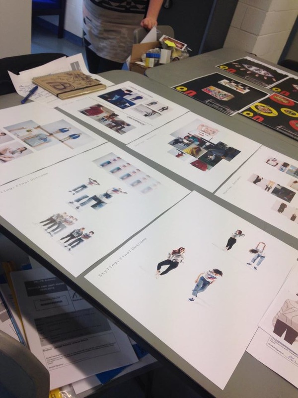
| | After handing in our mini ‘6 boards in 3 weeks’ task for Urban Outfitters I took part in a final crit. We spread our 6 boards across the class to be assessed. Firstly, we had to analyse our own work highlighting the strengths and weaknesses from our handed in work. I am especially pleased with how my final outcome for this project looks. My other strengths were gathering primary research by taking my own photos and scanning in Urban Outfitters branding. I liked the running theme and layout throughout my boards and I feel like I managed to keep the project concise. On the other hand, I could have held further in depth annotation across the boards. Although my imagery was strong, a few extra notes throughout would have made the process throughout my project more understandable. Seeing the final boards printed out also made me realise how much information you can possibly fit on to an A3 sheet to make it look more complete. We then, in small groups, discuss our finished projects. To determine if the development from start to finish was clear over the 6 boards, our peers had to firstly try and explain my project back myself without any pointers. Although most feedback was positive, one peer did comment she didn’t fully understand the purpose of my final outcome. This backs up further that extra annotation was needed. When looking at other students work I was inspired by great layouts and design ideas for boards. Bella’s continuous black boards and bright pops of colour stood out for me. I am really happy with how I finished this project. This project has prepared me greatly for making my concise and understandable portfolio. |
|
0 Comments
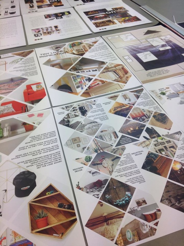
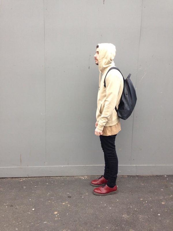
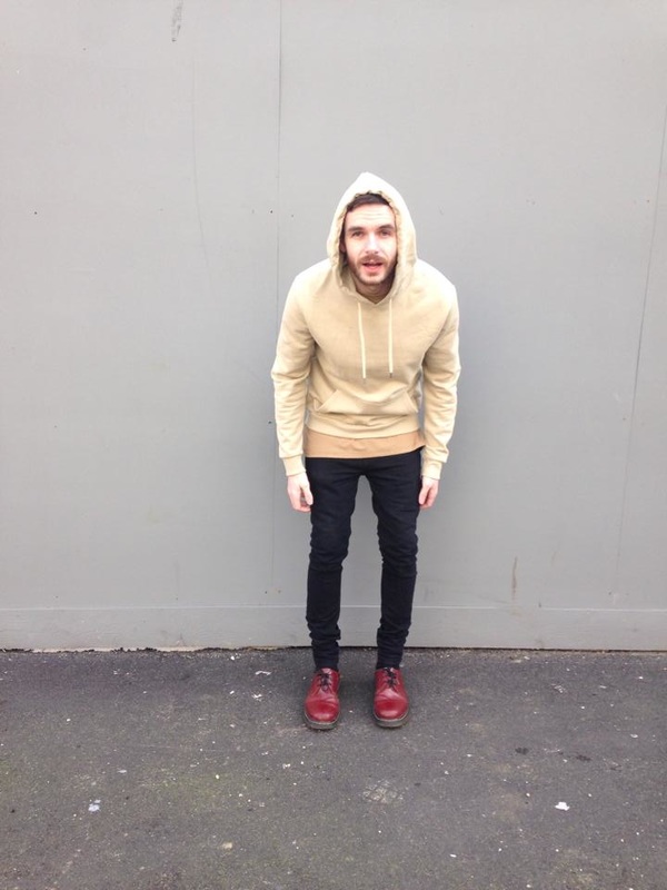
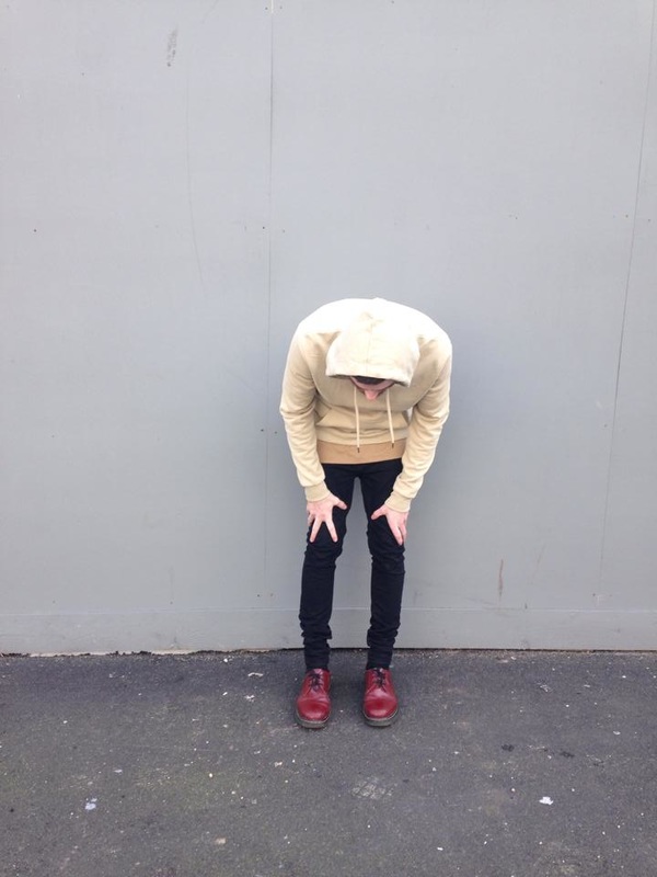
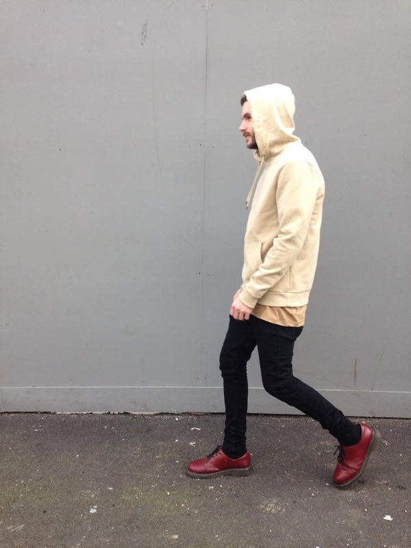
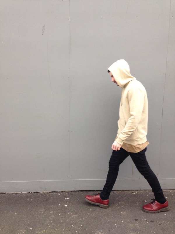
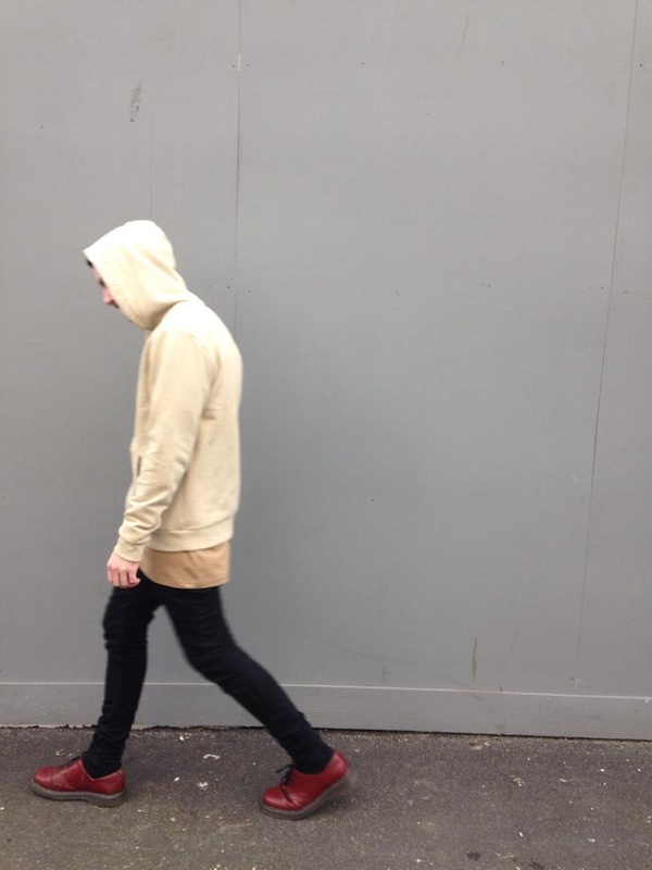
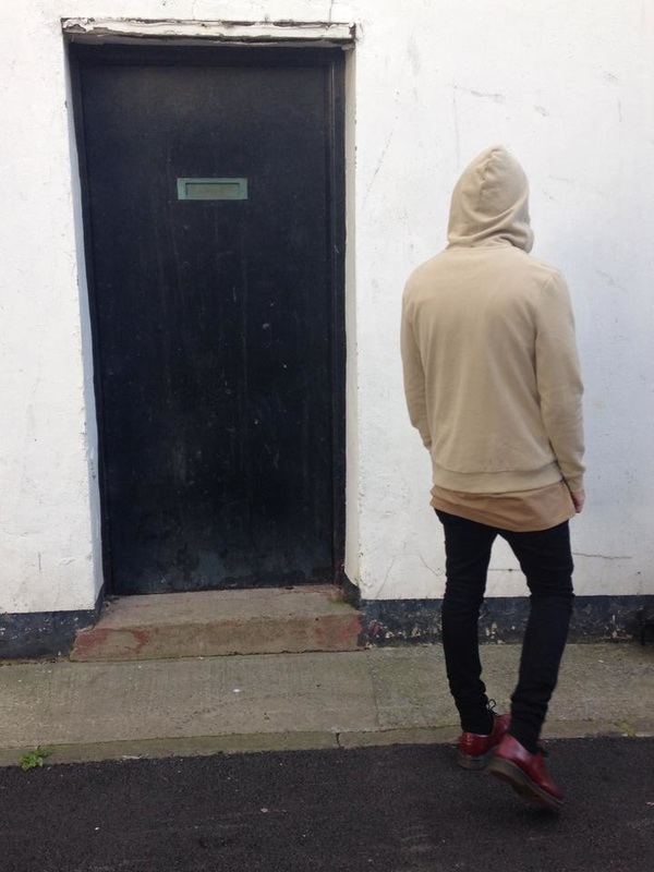
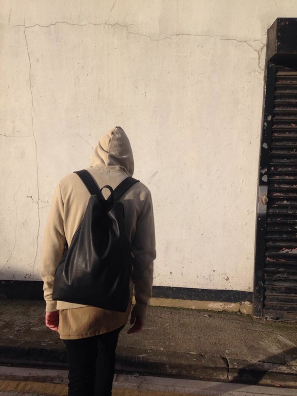
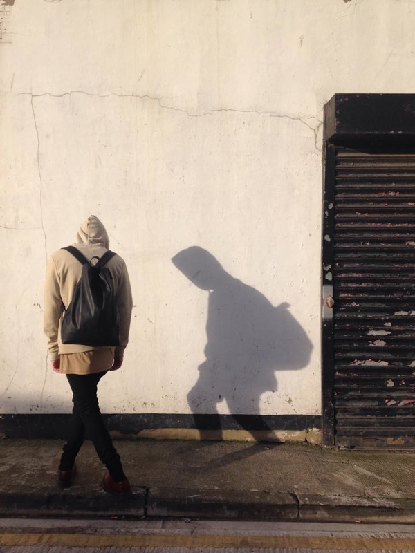
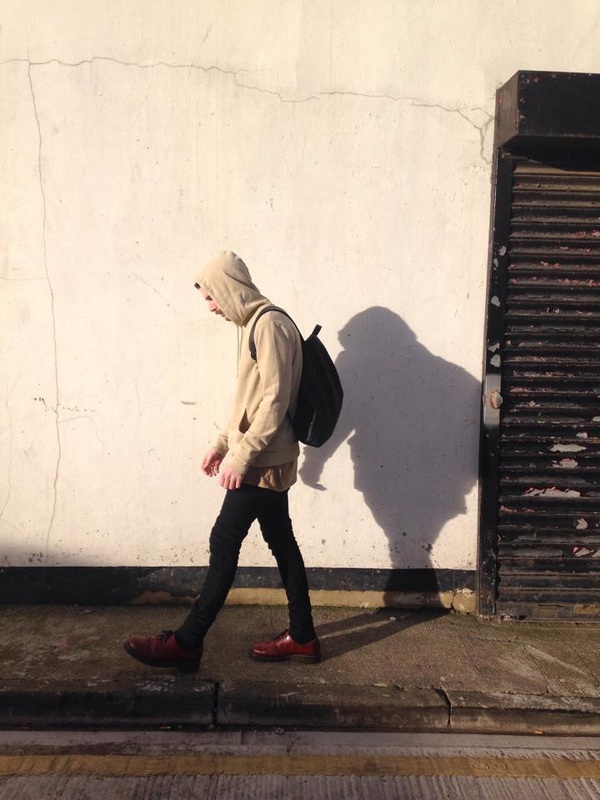
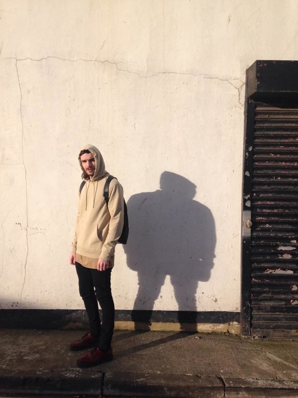
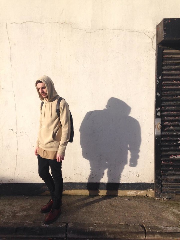
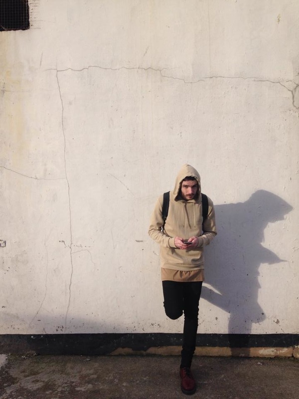
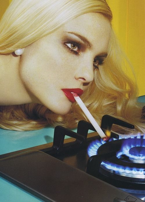
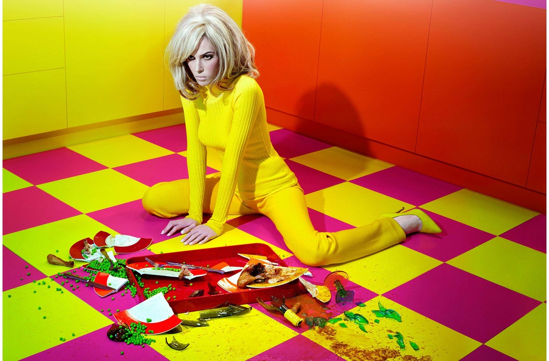
 From what started out as a un-notable day at Topman Sunderland, turned out to be surprisingly fun. Liam Haswell, art and creative genius, asked me for my help on his current project. As a part of his visual merchandising job, he is also a part the Topman Instagram team. His posts have to meet somewhere in the middle of campaign shots and street shots. ‘Yeezy’ was the trend he had been assigned with (totally not his cup of tea). My job was to take the snaps of him. Being quite the critic himself, I felt the pressure! However, I found this would be good experience as ‘selfies’ was as far as I went when it came to playing the photographer role. We went on a wander for locations which would capture the essence of the clothes. I was slightly sceptical about not being able to find a good spot in Sunderland. From the I-Phone, I captured Liam walking in front of industrial walls and high rise buildings. Relaxed, every day actions complemented the clothes and location. At one point, the sun formed great ‘Yeezy’ like shadows across the concrete wall. These images created the most impact and were my favourite out of the shoot. I learnt that not the fanciest of locations create the best images. Something as simple as an IPhone, good lighting and a wall in Sunderland can be all you need. I love the large scale mood board’s arrangements around the class room this morning. My favourite, a Topshop Boutique board. The layout is balanced with a strong colour story. A wide variety of images from outfit builds, pattern texture, logos, mood images are used to fill the space. By looking at the board I cab instantly connect it too Topshop Boutique. I would love to use large scale boards like this to present some of my work.  Although I love creative, design projects, during year 1, I received a below target grade for a fashion illustration project. Since then I have avoided including this style of work into my projects. However, I have been inspired by graphic fashion illustrator Roberto Sanchez (see below). After I found Roberto Sanchez, I then researched other graphic illustrators. I excel when it involves graphics. I thought this style of fashion illustration would be achievable and successful. I proposed an idea of incorporating my own designs into my current Urban Outfitters branding project. I used a simple technique of outlining an image on Adobe Illustrator. I then experimented adding shapes and colour to my designs. The end result was extraordinarily successful. I am thrilled with the final designs. Experimenting with the programme, Adobe Illustrator, also strengthened my graphic skills. I am going to use these designs in my final branding material. Having saved my design at different stages throughout the process, I will record the development on one of my six boards. 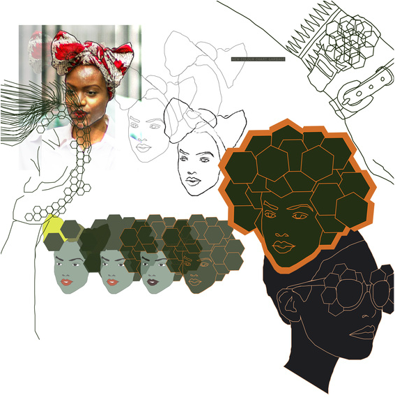 As practice for creating my portfolio, I have been given a short project to complete in 3 weeks. The only guide lines for the project is it had to be associated with the brand Urban Outfitters and must be made up of only 6 boards. The boards had to show the progress from research to development to final outcome. This layout should be used for the rest of my portfolio. In previous project feedback I am always advised to carry out further primary research to push me into a high distinction level. In action towards my past feedback, my first step of research was to go straight to the store to take photographs and analyse the shop. This helped me determine what direction my project was going in. A weakness I identified in the shop was their jewellery branding. I thought it was dull and unrecognisable. I collected samples of their current branding to scan in for my project. Here is the primary research I collected. Fashion Photographer and Artist. My biggest obsession. Graphic, colour co-ordination. 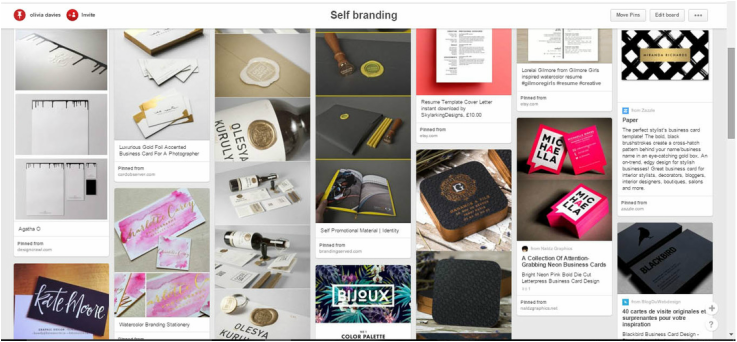 Pinterest is great for stimulating ideas for my Self-Branding Pack. My main focus was to gather designs and layouts that I like onto one pin board. I have been using search terms such as "creative cv", "business cards", "fashion cv" and "self-branding pack". I have been drawn to bold patterns and colour as I think they best describe my work. I will look further into patterns on WGSN to use as a running theme throughout my pack. To balance out the heavy background, simple layouts for would be best so it is not overwhelming. I have concluded that ‘Vibrant’ and ‘Sleek’ is my brief for this project. For my business card, I would really like to include a different element other than just pattern and text. I have looked at shape, texture, lazer-cutting and materials. Gold foiling seems to be a popular trend on business cards. I will research into printers to see what effects are achievable. I have been advised to consider ‘Moo Printing’ for good quality business cards. To tie the pack together, I think the most achievable is to keep it simple. Using Pinterest and my previous branding project as inspiration, I think ribbon, a branded sticker or even stamp (as used in my previous branding project) is a great way to complete the branding pack.
There was some outstanding work pulled together for the Fashion Retail and Enterprise open evening. Not only was it an opportunity to show the work from my year group but to view the work (competition :P) from the level 4 students. My favourite was a fashion illustration project from a girl in level 4! The display as a whole caught my eye. A strong colour story and theme through out. Her ideas were so clever. A very inspiring project! 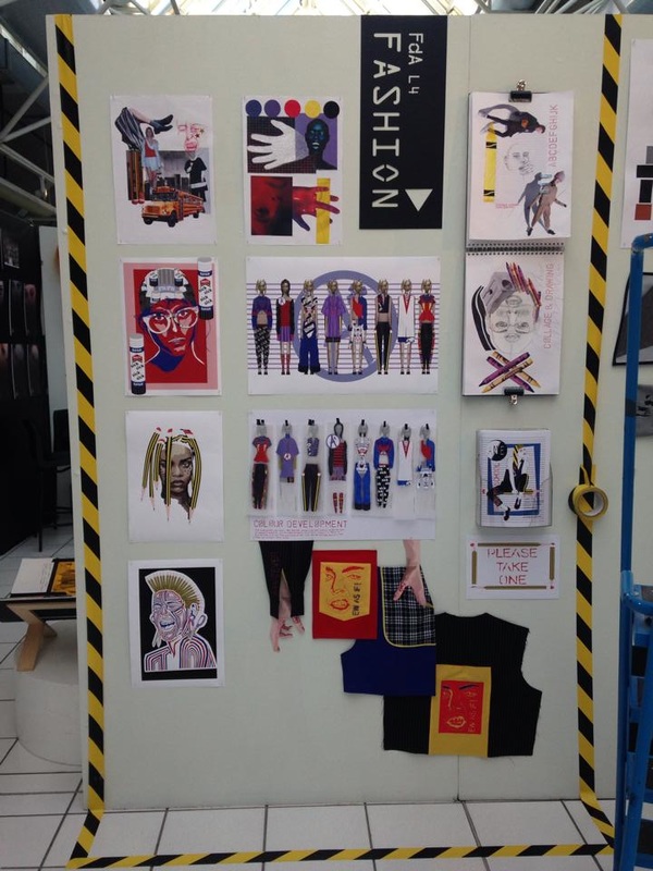 |
AuthorI am Olivia Davies, aged 20. This is my blog for Fashion Retail and Enterprise. Archives
March 2016
Categories |


 RSS Feed
